Improved design of the risk tolerance test

Many of our professional customers and their clients found our risk tolerance test difficult to interpret. Therefore, with the help of a UX/UI specialist, we conducted extensive research in May of this year, which led to an enormous improvement in the design of our test. Not only do we find this ourselves, we’ve of course also researched it. We’ve set up a test panel with over 500 respondents, further education level and higher. 88% of them say that they now understand our new test very well. Our new risk tolerance test will go live in mid-December, but you can already try out a sneak preview and tell us what you think of it:
Note: this test version works with a fictitious investment amount of € 50.000,-. Imagine that this is the maximum amount you can invest when trying out the test. In the soon-to-be live version, this obviously will be the amount with which your client intends to invest eventually — in accordance with the recommendations of the Dutch regulatory institution AFM.
When investing, return and risk go hand in hand. Not every client is aware of the risk they’re willing or unwilling to take. That’s why determining a client’s risk appetite is a legal obligation. But it’s also simply sensible: we all want to prevent our clients from being confronted with a loss that is much greater than they are prepared to take. But how do you determine a client’s risk appetite? The law doesn’t provide an unambiguous answer to this question, so we see all kinds of creative solutions emerging in our industry. Think of questionnaires with questions like “How do you sleep at night when the stock market is at a loss?” Nice thought, but what does the answer tell us? And how do we quantify this in terms of risk appetite?
That’s why we at Blanco were looking for a way to make a client’s risk appetite truly quantifiable. This is also in line with the AFM’s recommendation in the ‘Guidelines for the fulfillment of the duty of care in the case of (semi-)automatic asset management’, in which the AFM indicates that it prefers the use of quantitative questions on the basis of scientific research. Moreover, it’s a good step towards fully automated onboarding of clients. After all, if the test result is truly quantifiable, we can link a client profile and associated investment portfolio to it. And that’s efficient.
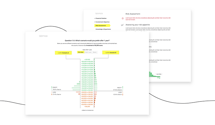
This resulted in an online test in the early days of our platform, in which a client is shown a number of profit/loss scenarios within the period of one year (because that is what the law obliges us to ask). Based on the percentage of profit or loss within one year, plus the corresponding absolute amounts, a client should indicate which scenario he or she finds the most attractive. See the screenshot below:

Many clients find this quite incomprehensible. That’s not the intention, of course, because the idea behind our test is precisely that we want to get a well-founded idea of a client’s risk profile. If you don’t understand the test properly, you can question its outcome. That is why in May this year, with the help of a UX / UI Specialist, we started investigating why people do not understand the test properly: we have discovered that the problem is mainly caused by two things: too difficult visualization and too little explanation.
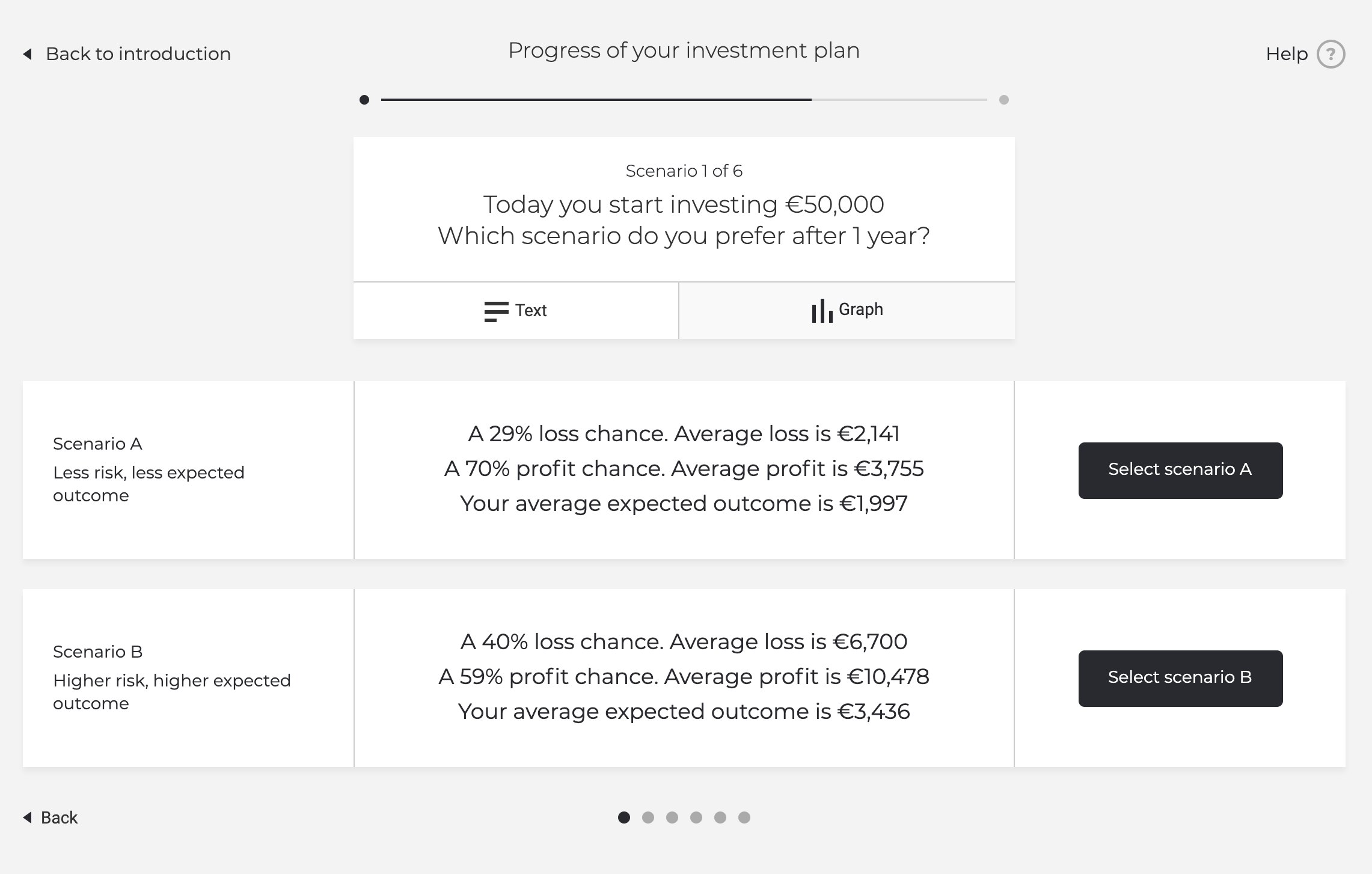
In our new design of the risk tolerance test, we therefore share much more information, allowing clients to make much more informed decisions about which scenario appeals to them most. See the screenshot below:

A client can now see at a glance that, by choosing the more defensive scenario, he or she is also closing the door for a chance of a possible (very) high return. After all, the client not only sees an ‘average’ amount of profit, but also a potentially much higher amount of profit. In short: we offer much more context, without making it unnecessarily complicated. This allows clients to make a more informed choice.
To make sure that the new design really is an improvement, we’ve put together a test panel of about 500 people with a further education level and higher. 88% now say they understand the test, even though we’re actually giving more information. Less is not always more. Moreover, we see 70% of the respondents answering the questions consistently. This also indicates a better understanding than before. And last but not least: 73% of the respondents indicate that the assessment of their own risk appetite now corresponds to the result of the test. It is of course a difficult subject, measuring the risk tolerance of a client. But with these good test results, we dared to implement the new design.
Our new risk tolerance test will go live in mid-December. Obviously not only in English, but also in Dutch and French.